ADOBE MOVIE POSTER MOVIE CONTEST - BEST ILLUSTRATION WINNER
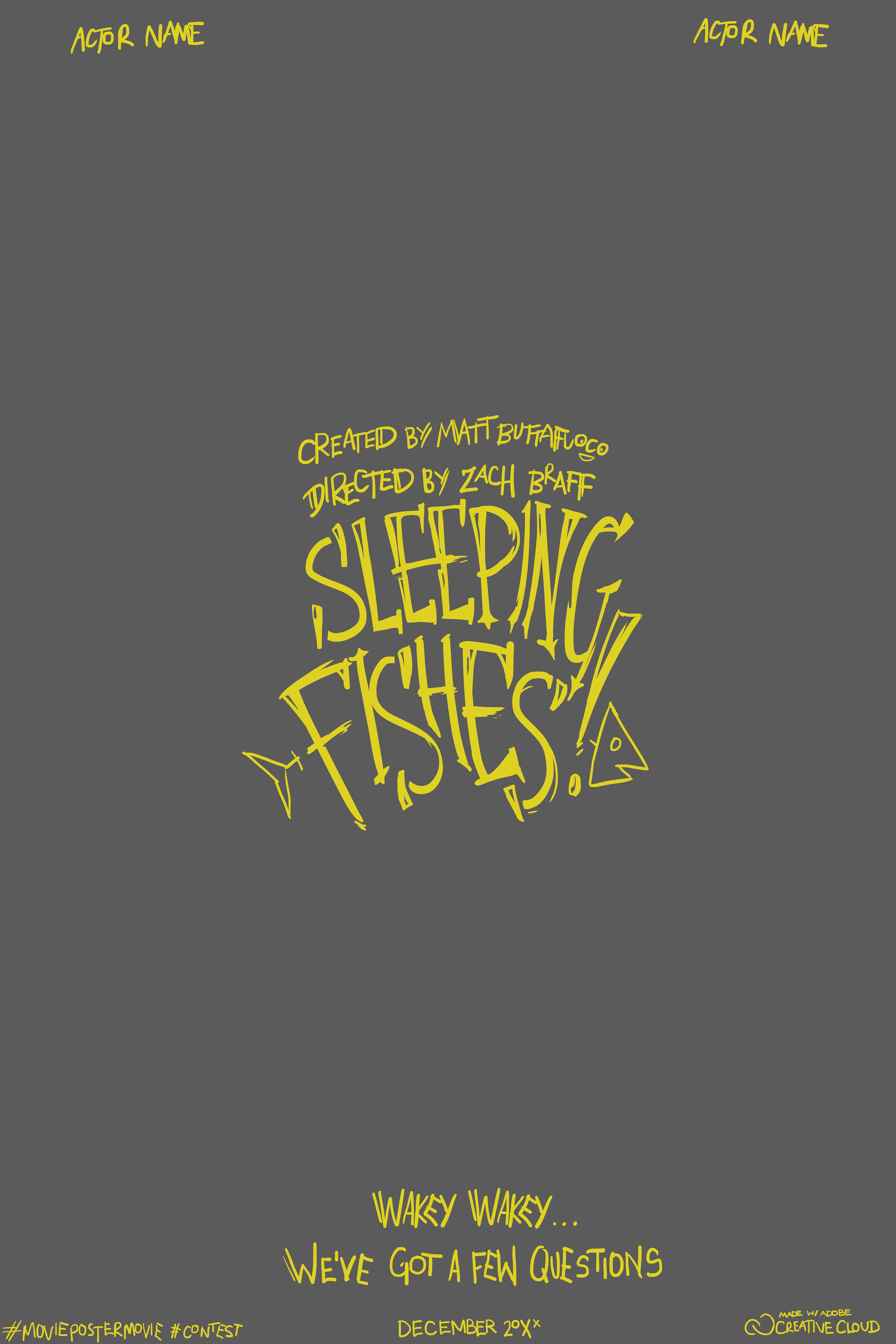
My illustration actually started with the logo! I wanted to design a logo that was sharp, bold, and edgy. The movie concept in my head had to do with the mafia, so I pulled from the "sleeping with the fishes!" motif. I wanted the jaggedness of the logo to reflect ideas of fishhooks.
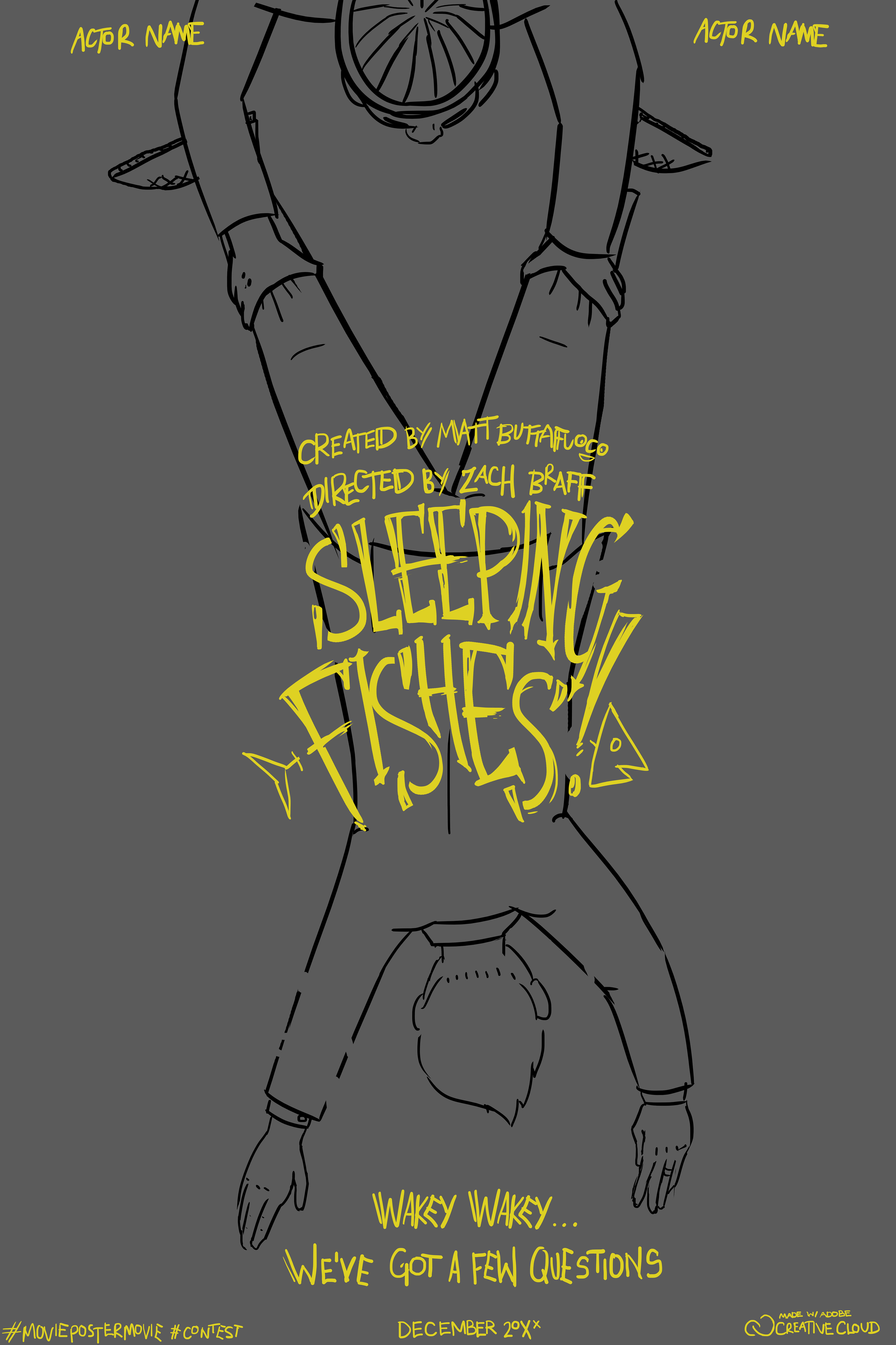
Next, I decided to use a top-down perspective to help ground the logo. I could already imagine this title appearing in the movie, with the man pulling the body to "wipe" away the words
The piles of fish came next, as well as the basic boardwalk layout, and the coloring for the body. The fish were so much fun to draw! they have many interesting shapes- I especially liked drawing the fish bones which also appear in the logo.
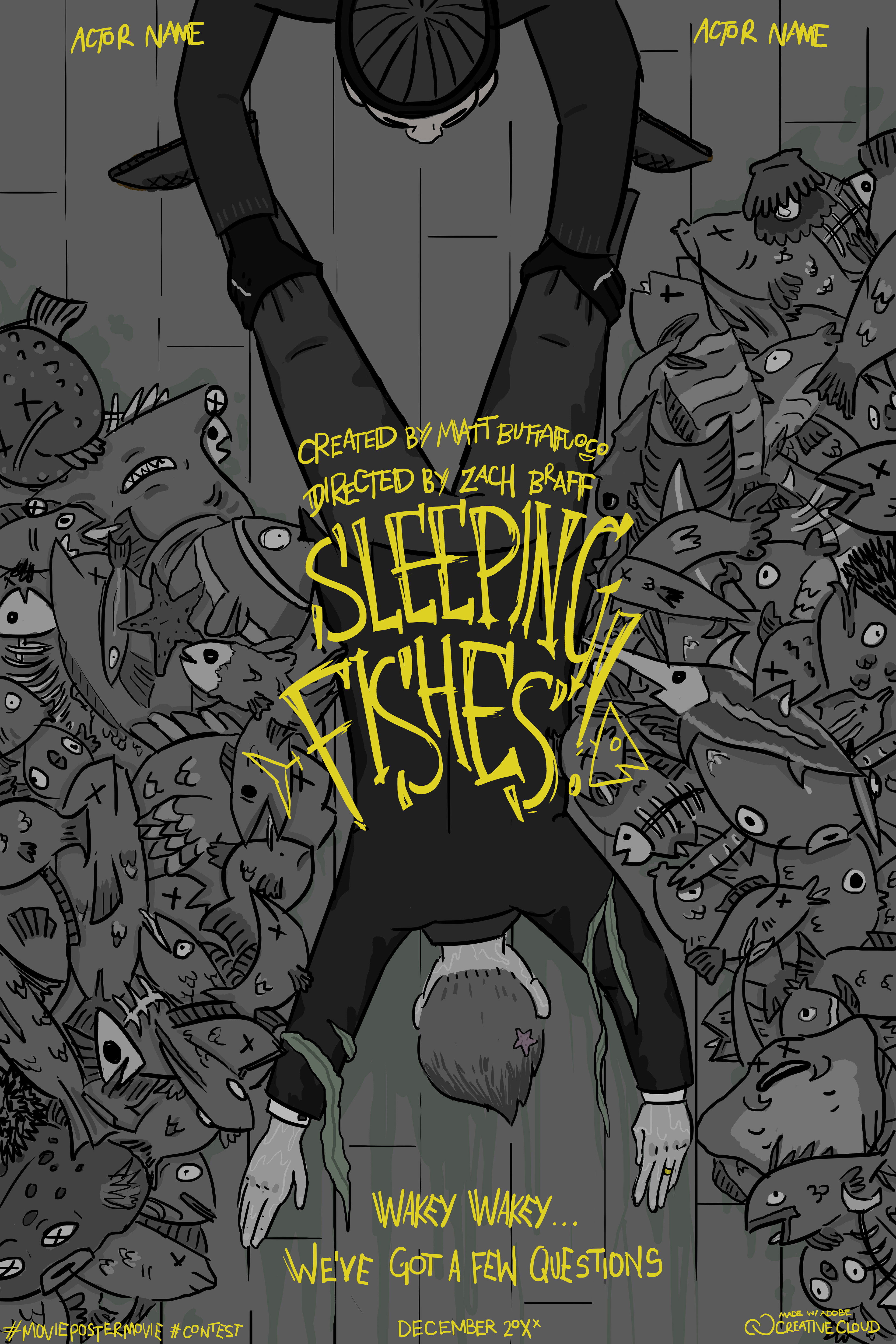
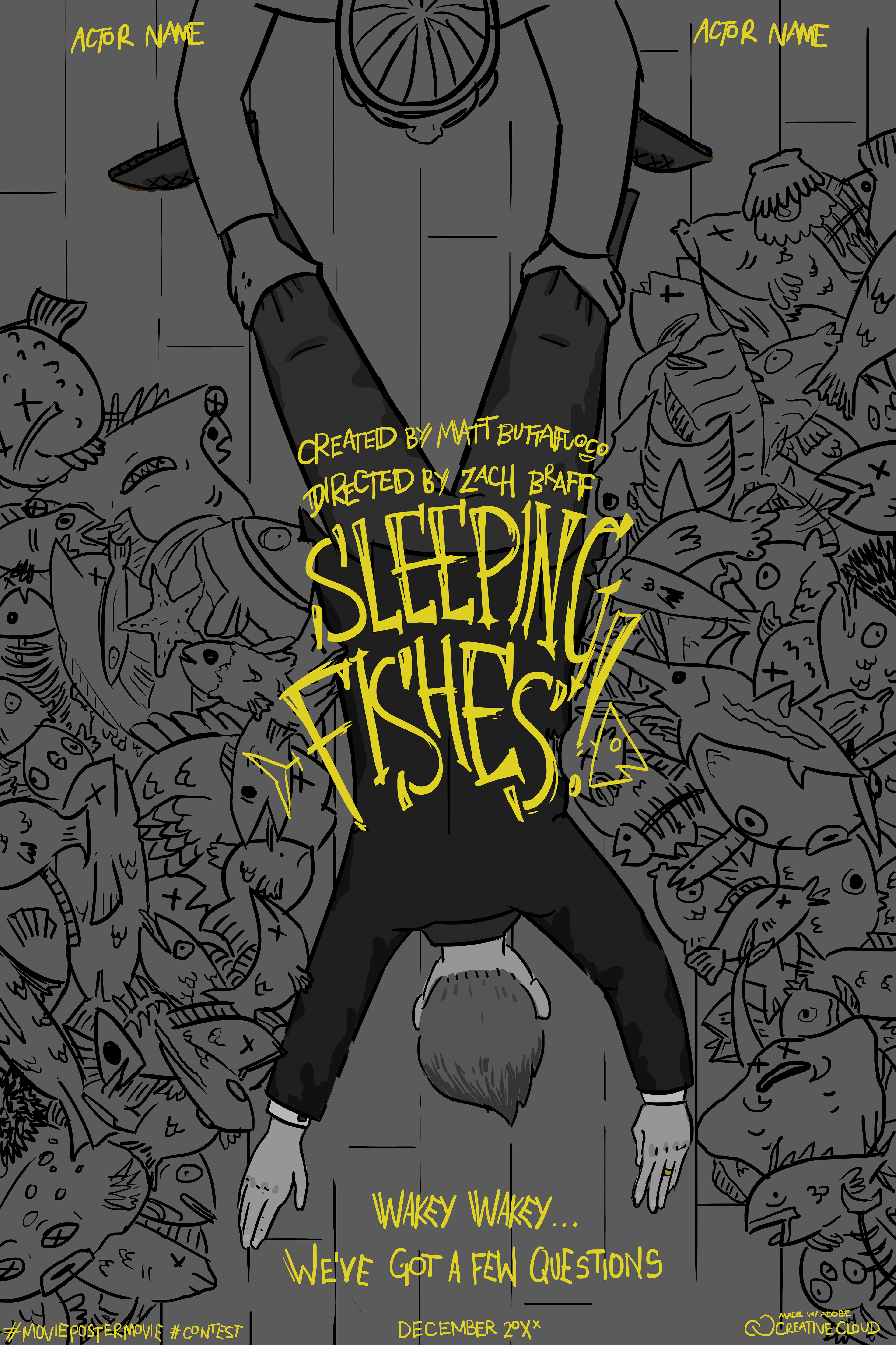
A lot happened here! Seaweed, water, and shading on the fish and the man pulling the body! Gray-scale and very cool colors are dominating here, which wasn't the tone I was going for. I wanted this film to feel aggressive and mysterious!
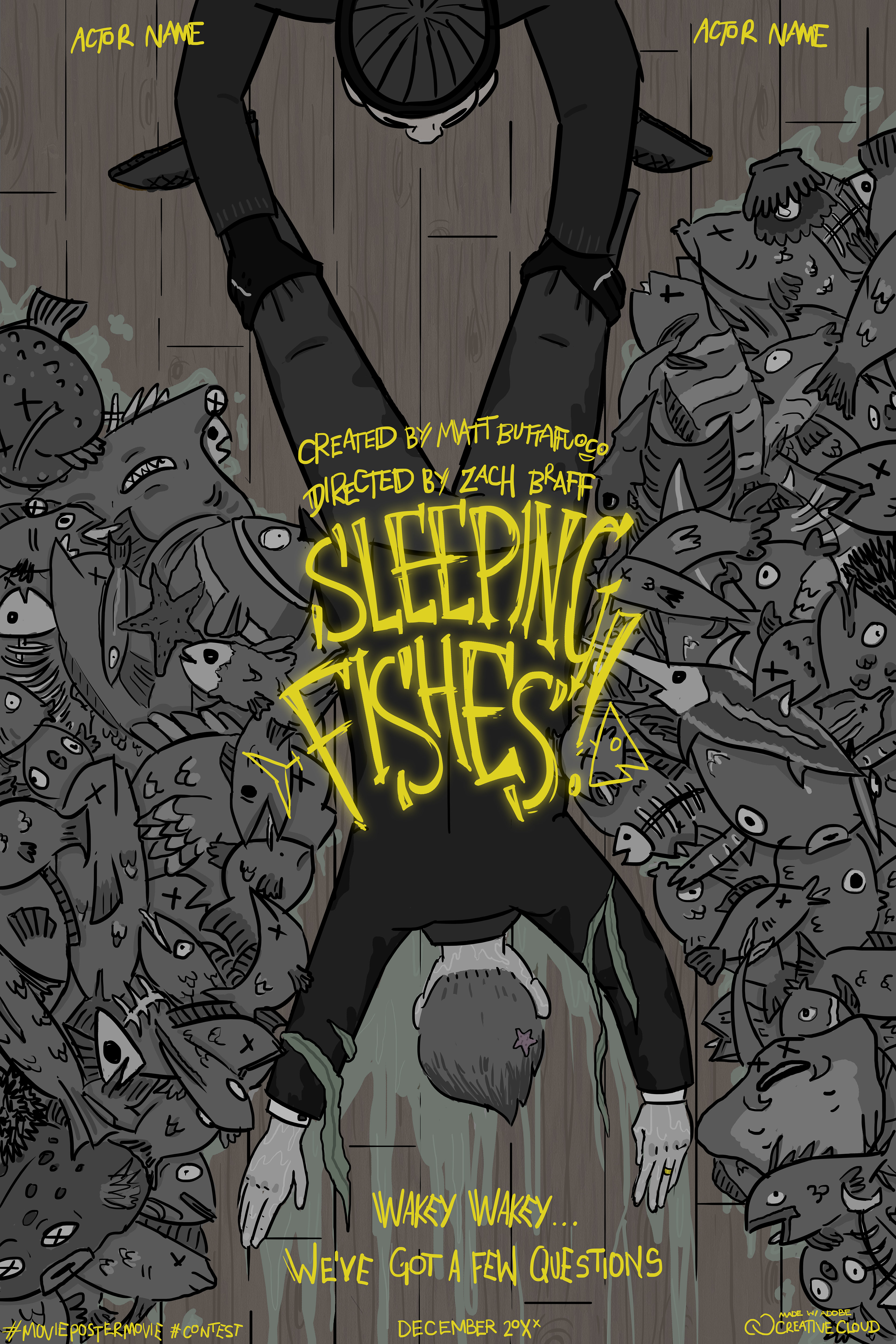
Texture was added to the wooden planks of the boardwalk, as well as an overlay to make it slightly warmer, which helps the water puddles and drips stand out. I also illuminated the logo here, which I felt inspired more ideas of the mafia, with city lights and what-not.
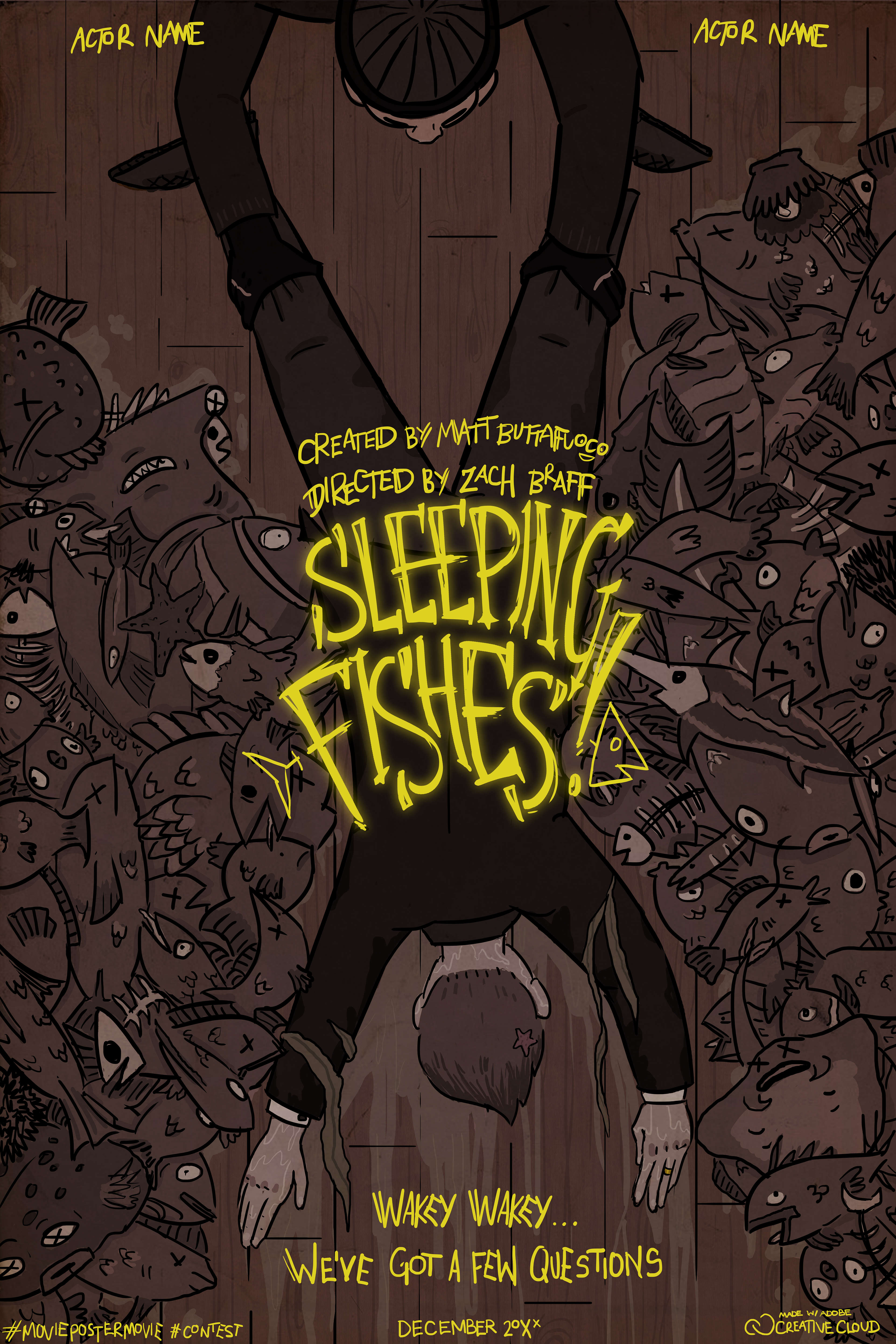
The final! The red overlay makes the entire thing pop, and gives it the exact ominous and aggressive tone I was looking for. My movie concept was about if the mob discovered they could keep people in a sort of "stasis" underwater until they needed to get more information from them, and would probably follow one of the "sleeping fishes" who was just pulled out from the water- hence the tagline "Wakey Wakey... We've Got a Few Questions"